Content Inventory, Relaunch und Upgrade to TYPO3 v13
The SEGGER corporate website was not only upgraded from TYPO3 v9 to v13 and fundamentally modernized in close collaboration with the client, but also thoroughly reworked in terms of design, structure, and functionality.
| Client | SEGGER Microcontroller GmbH |
|---|---|
Project duration | 2024–2025 |
Comprehensive analysis and strategic content inventory
We started the project with a comprehensive content inventory and an in-depth analysis of all existing SEGGER systems (TYPO3 website, knowledge base, blog, and two shops) to create a harmonized system landscape.
Together with SEGGER, we took a detailed look at three topics:
Target groups: We defined target groups, developed personas, and assigned them to the respective systems. On this basis, existing and required content could be identified and organized in a structured manner. Selected sections and systems were given new, more appropriate names.
Existing contents: The current page and content structure, especially in the product area, was reviewed. SEGGER has significantly revised or rewritten some of the content.
Current presentation: We also created a detailed overview of how and for what purpose the various content elements are used in TYPO3. This allowed recurring combinations to be replaced with new, tailor-made elements. Components that were no longer needed were removed in the course of the project.
In addition to this fundamental inventory, the product pages underwent a redesign in terms of content, and a modern design with revised navigation structures was developed. The accompanying frontend prototype was later migrated into the TYPO3 installation.
In this time, SEGGER also reorganized its product range, changing it from four to five product categories.
Our hybrid project methodology
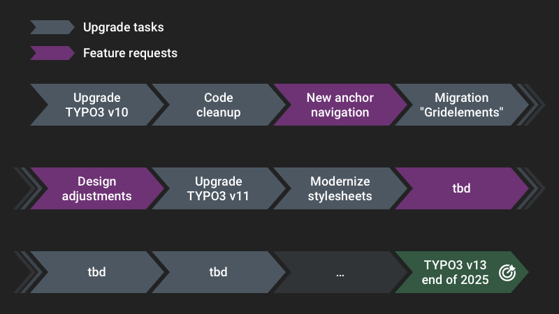
The switch from TYPO3 v9 to v13, along with the relaunch and restructuring of content, required careful planning.
Setting up a new TYPO3 system and then migrating content didn't seem like a good idea to us, as we expected to receive regular change and feature requests during ongoing operations.
We have therefore decided to use a hybrid approach (waterfall and agile elements):
- Upgrades and modernizations are split into small work packages that can be delivered quickly.
- The next steps are regularly agreed with the customer and documented in a roadmap. Only the upgrade to TYPO3 v13 has a fixed deadline of the end of 2025.
- The roadmap always left room for additional projects, enabling SEGGER to respond quickly to market needs.
Using this method, we counted more than 1,000 Git commits from the upgrade to v10 to the upgrade to v13. Our manually maintained changelog includes nearly 100 significant innovations for this time period, ranging from setting up a styleguide page tree to optimizing image rendering.
Intrigued? We have described this project methodology in more detail in a blog post.
"Pair Editing" session with the editors
In addition to the regular meetings, we arranged an in-depth meeting with the SEGGER editorial team. We wanted to understand in detail how they work with the current system and identify any problems they are experiencing.
The name is derived from the Pair Programming technique, in which two developers work together on a task using a single computer.
We discussed the various questions, issues, and expectations in a roundtable setting.
We were able to resolve some issues directly on site. The others can be grouped as follows:
- Errors or missing functionality in the old TYPO3 system. Many of these were resolved by upgrading to a newer version of TYPO3.
- Unclear maintenance due to outdated or superfluous fields and options in the backend. Other issues included options that only had an effect in the frontend in certain constellations. Once again, this demonstrates the importance of configuring a user-friendly backend and planning new features for the long term.
- More flexible options for placing content.
- Variations in spacing between content that were difficult to influence.
This resulted in additional tasks that we were able to implement in conjunction with the upgrade project.
Relaunch
The new branding guidelines have been gradually implemented on the website. Nunito Sans is now used as the new font. Headings are now set in bold.
We have standardized spacing on the pages and created more white space at the same time.
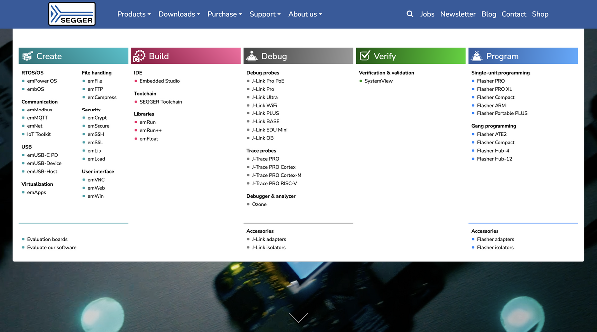
The navigation elements in the website header have been merged and reduced.
Change of the product range
As a first step, we incorporated the five new product categories into the website. This adjustment involved redesigning the home page and creating new content elements to present the categories. We redesigned the product section of the main navigation and removed the former mega menu.
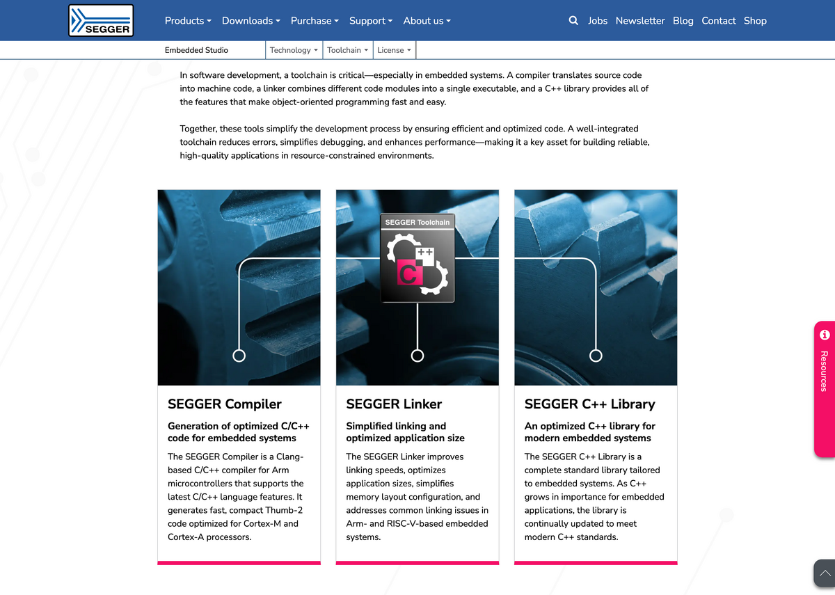
Product pages
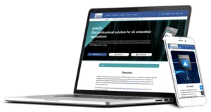
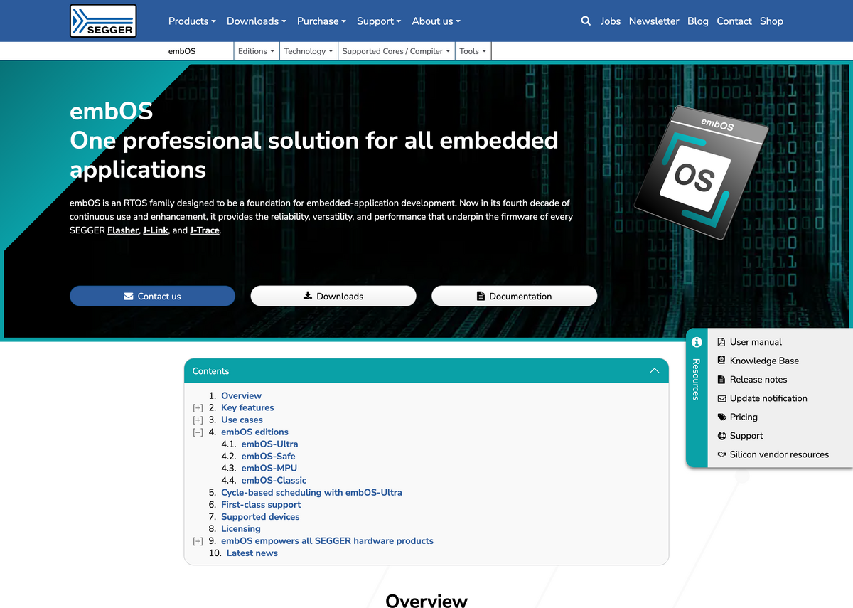
A major innovation in this project was the modernization of the product pages. In terms of content, SEGGER created a uniform structure with recurring sections such as “Use Cases.” The design created during the analysis project was finalized and implemented in TYPO3.
The product pages are now styled in the color of the respective product category, which is automatically applied to specific content elements and components. The anchor navigation and resources menu were completely redesigned.
For consistency, the new page layout was also applied to all other content pages.
Technical upgrades and improvements
In addition to the TYPO3 upgrades, we brought all components of the installation to the state of the art and streamlined the system overall.
We replaced outdated TYPO3 extensions with core methods or current solutions.
By switching from Bootstrap 4 (and Bootstrap Package) to tailor-made custom styles and utilizing modern browser technologies, we reduced the primary stylesheet to almost a third of its original size. As a result, loading times and performance have been significantly improved.
We simplified and modernized the HTML structure for all new and many existing website components. Structured data was also included for various types of content.
These measures provided lasting improvements to semantics and accessibility.
The frontend optimizations also significantly improve Core Web Vitals. For mobile devices, the average score increased from 71 to 98, and for computers from 91 to 99.
UX improvements for editors
Many quick wins were possible in the TYPO3 backend, such as hiding unused fields or configuring a non-public news preview page.
In other areas, we analyzed in greater depth whether certain options were still in use and whether better solutions could replace them.
The spacing and alignment of content were standardized, as were the selection of backgrounds and the use of rounded borders. Existing content (no less than 30,000 active data records) was always kept in mind and migrated as needed.
The existing gridelements were replaced by container elements. We converted recurring, nested content structures into customized, lean content elements. This simplifies editorial work and significantly reduces the complexity of the page structure.
Automatic database migrations
When we replace content elements with a new, improved solution, existing records must be properly migrated. The same applies to switching page layouts or adjusting fundamental styling options, such as content alignment.
We automated these migrations during the deployment of each adjustment. It allowed editors to concentrate on their actual work.
Discover the project from the perspective of:
Design adjustments
The website's design has been updated incrementally. The chosen font, Nunito Sans, ensures a contemporary, professional appearance. The headings, now in bold, improve the readability of the content.
The spacing between all content has been standardized. Manual adjustments are now only set in one direction.
For content with dark background colors or images, the text is automatically displayed in white. Manual override is no longer necessary, but is available if needed.
Design adjustments
Default spacing between all content is defined using CSS custom properties and is only set downward. In container elements, the outer spacing of the last child element is automatically removed to avoid double spacing. Certain elements can have different default spacing. Manual adjustment is possible in all cases.
Text colors adapt to the background of the element (also via custom properties). Readability is always ensured, even with multiple nested elements with changing backgrounds.
UX improvements in the backend
Each record only displays the fields and options that are actually functional. They have meaningful labels and, where necessary, explanatory descriptions.
Fields that are thematically related are grouped together. Maintaining content has been made more logical overall.
Custom content elements make it easier to maintain recurring content.
UX improvements in the backend
Unused fields and options in the backend were either completely removed or hidden using TSconfig.
There are several variants of “Card Group" elements that share an inline child element. This allows for quick changes to the design. Using columnsOverrides, only the fields of the child table that are required for the respective “Card Group" variant are displayed.
Richtext editor
The different ways of inserting icons into text have been standardized. Using a dropdown menu with icon previews and labels, editors can select both Font Awesome icons and project-specific symbols.
Another drop-down menu allows scalar values to be inserted and edited as graphical elements (similar to a progress bar). This is used in the project to visualize comparative values.
Richtext editor
Four RTE plugins were developed to meet the following requirements:
- A central icon selector for selected Font Awesome icons and custom icons (which were previously available in the Styles dropdown)
- A dropdown for inserting and modifying editing
<meter>elements - Furthermore: Allowing
<div>elements in addition to paragraphs, as well as deactivating the Autolink plugin
The icon plugin was developed for both CKEditor 4 and CKEditor 5. The double effort made it possible to consolidate the text editor at an early stage and dispense with the Font Awesome plugin, of which only a few icons were actively used.
Modernizations
Upgrades and current server components have significantly improved backend and frontend performance.
The switch to modern extension solutions has simplified and standardized editorial work.
Necessary database migrations were carried out automatically.
Modernizations
Gridelements were replaced by container elements and new, dedicated content elements.
Used components of the Bootstrap Package were integrated into the project's site package.
Additional plugins, such as those for code snippets, were replaced by current alternatives.
Migrations were reliably automated using upgrade wizards or plain SQL scripts during deployment.
Semantics and accessibility
All new website components have been developed using state-of-the-art technology. The existing page layout and other components have been semantically improved. Core Web Vitals show significantly higher scores.
Keyboard navigation is now more intuitive and visually highlighted.
The new FAQ element renders structured data using Schema.org for each entry. News, events, and other content are also enhanced with structured data.
Semantics and accessibility
Accordions are built with <details> and <summary> elements, with animations enhanced using JavaScript. Interactive events are triggered using the <button> element.
Focus styles are optimized for individual components, and the frame color automatically adjusts for content on dark backgrounds.
Quality assurance using a living styleguide and automated testing
During the course of the upgrade project, a page tree was created for the Living Styleguide, in which all page types, forms and content elements are set up in different (layout) variants. The styleguide forms the basis for the automated tests with the tools Cypress and BackstopJS, which are used to periodically check the functionality and layout of the website as well as for further developments.
Quality assurance using a living styleguide and automated testing
The regression tests based on Cypress and visual regression testing with BackstopJS facilitate the acceptance of upgrades and further developments. In this way, even small differences in design or changes in function are detected promptly and reliably.