User-friendly customization of the TYPO3 backend
“TYPO3 is too complicated!” – we've all heard or read that at some point. And yes, in some respects the criticism may well be justified. However, in many cases editors just had bad experiences that can be traced back to a neglected TYPO3 backend.
Great on the outside, lousy on the inside?
Unfortunately, we have (too) often taken over or seen TYPO3 installations where a lot of time was spent on a stylish frontend, but no adjustments were made to the backend.
The client is left alone with an overwhelming system, containing many standard options of the TYPO3 core that have no actual effect on the frontend. “Layout 1” in content elements? That should be removed (or renamed properly, if it is actually used).
So let's take a look at what we can configure and improve in the TYPO3 backend.
The absolute basics
- Use backend user groups to define and restrict access rights properly. No editor should have administration rights.
- Install the backend languages that your editors speak. And provide translations for your project-specific elements and fields.
Show everyone only what they need
The TYPO3 core comes with a whole range of content elements, record types, and modules. Some of these records have a large number of fields and options for a wide variety of use cases.
Many of these are not relevant to every project. Some only need to be made available to a selected group of people.
Access rights should always be configured via backend user groups. If fields are not in use, they should be disabled via Page TSconfig – this will also help us administrators and integrators in the long-term support.
Disable fields
Some fields in TYPO3 are probably only still included for historical reasons, while others are only needed for special use cases. The four fields from the page properties are listed here as an example:
TCEFORM {
    pages {
        layout.disabled = 1
        keywords.disabled = 1
        author.disabled = 1
        author_email.disabled = 1
    }
}
You can also disable or customize fields per element type (e.g. the CType), if required. The following configuration will hide the subheader field for all content elements except “Header” and “Text”:
TCEFORM {
    tt_content {
        subheader.disabled = 1

        subheader.types {
            header.disabled = 0
            text.disabled = 0
        }
    }
}
Remove content elements
You can also configure the available content elements via Page TSconfig. We prefer to use keepItems over removeItems for this. It gives us better control and an overview of which content elements will be available in the end.
We also group the elements according to their source or type:
TCEFORM {
    tt_content {
        CType {
            # TYPO3 Core:
            keepItems = header, text, uploads, list, form_formframework, menu_sitemap_pages, shortcut
            # Container:
            keepItems := addToList(container_1col, container_2col_50_50, container_3col)
            # Sitepackage:
            keepItems := addToList(hero, quote, card_group, timeline, accordion)
            # Third-party extensions:
            keepItems := addToList(news_pi1, news_newsdetail)
        }
    }
}
Provide guidance
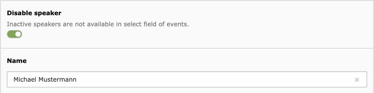
Some options are easier to understand if a short description is given along with the field label. This can be added using TCA or Page TSconfig.
TCEFORM.tx_myextension_domain_model_speaker {
    hidden.description = LLL:EXT:sitepackage/Resources/Private/Language/Backend.xlf:tx_myextension_domain_model_speaker.hidden.description
}
Allow elements only where they are useful
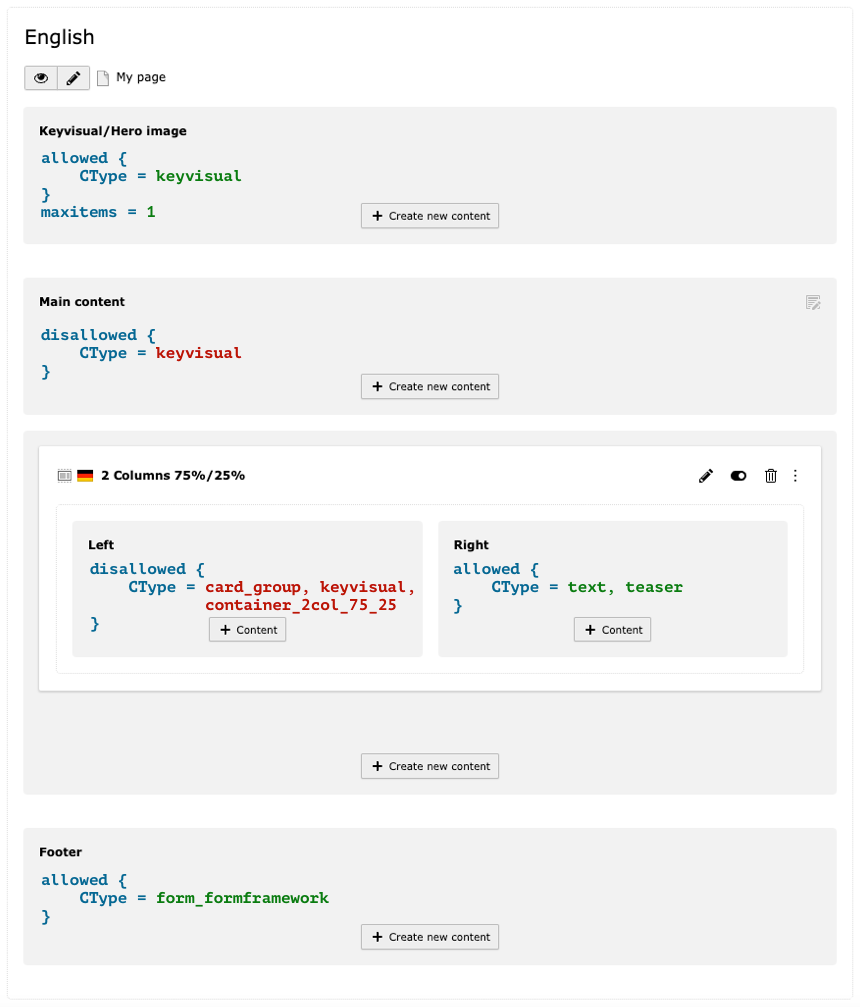
The container element has a larger column on the left, where the keyvisual and the card group are not permitted. The nesting of containers is prohibited as well. In the right-hand column, only text and special teaser elements are permitted.
Availability of content elements
With the “content_defender” extension, you can control which content elements may be used in backend layouts (and inside container elements).
Content elements (CType) and plugins (list_type) can be explicitly allowed or disallowed in each content column as needed. You can also define the maximum number of elements in a column.
These configurations can ensure the correct use of your content elements:
- There might be hero/header elements that should only be used at the beginning of the page
- Nested container elements (or gridelements) can lead to layout issues
- More complex content elements are often not suitable for narrow columns; for example, a card group that itself already has several columns
- Special content elements could, for example, only be designed for use in a sidebar or multi-column containers
Limitation of other record types
Imagine you have created a page of type “Folder” in which editors can maintain events in a central place. Why should they also be able to create glossary entries there? Restrict the creation of new elements in the page properties with Page TSconfig:
mod.web_list {
   allowedNewTables = tx_myextension_domain_model_event, sys_note
}
As a general rule, global configurations belong in the sitepackage (file-based and versionable). However, TSconfig settings applied in individual parts of the page tree may be set directly in the page properties (that is, in the database). Conditions in the sitepackage are also possible – you can choose the best solution depending on the scenario.
Set meaningful default values for fields
Let's stick with the example of the events mentioned above. These are more extensive in the given project, so you have now created a separate folder for each type of event (webinar, workshop, exhibition, …).
In each folder, you can now set individual default values for events using Page TSconfig: the type, the workshop language – everything that applies to the majority of this event type.
TCAdefaults.tx_myextension_domain_model_event.event_type = webinar
TCAdefaults.tx_myextension_domain_model_event.workshop_language = de
You've just eased your editors' workload again.
Optimize the richtext editor (for individual elements)
In general, the text editor should always be adapted to the specific project. The necessary text styles and all other options can be configured via YAML.
However, there are often use cases where the “ large” RTE offers too much liberty. The text field of a teaser element may require bold text and soft hyphens. A table is probably not needed, though.
In some cases, links in the richtext field are also not suitable. For example, if the entire element in the frontend is already linked through a separate link field.
Therefore, you should always create separate RTE configurations for such scenarios and assign them to those elements (documentation). The simplified text editor relieves the editor and avoids errors and misunderstandings.
Use the customization capabilities
Helpful icons
Icons can support the editor when maintaining the content. Select fields for (image) alignments or background colors are a good example.
An optional icon for select fields can be easily added in the TCA:
'backgroundcolor' => [
'label' => 'Background color',
'config' => [
'type' => 'select',
'renderType' => 'selectSingle',
'items' => [
[
'label' => 'None',
'value' => '',
'icon' => 'EXT:sitepackage/Resources/Public/Icons/Settings/color-none.svg'
],
[
'label' => 'Blue',
'value' => 'blue',
'icon' => 'EXT:sitepackage/Resources/Public/Icons/Settings/color-blue.svg'
],
[
'label' => 'Orange',
'value' => 'orange',
'icon' => 'EXT:sitepackage/Resources/Public/Icons/Settings/color-orange.svg'
]
]
],
'l10n_mode' => 'exclude',
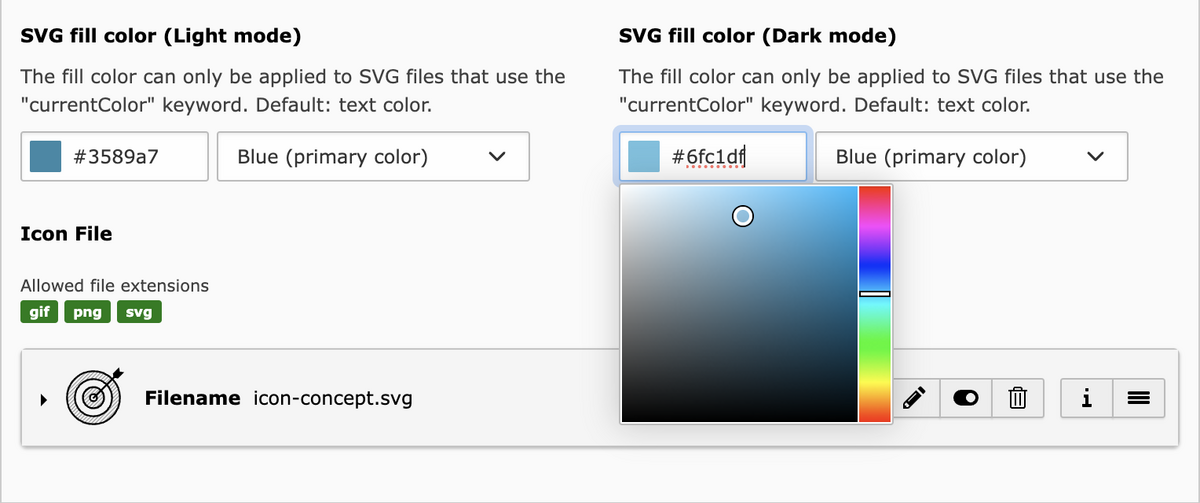
],The icons could each be a simple SVG with a colored rectangle:
<svg viewBox="0 0 18 18" version="1.1" xmlns="http://www.w3.org/2000/svg">
    <rect fill="#5930ab" x="0" y="0" width="18" height="18"/>
</svg>
Of course, you can also invest a little more time and effort and use a drop of color or similar symbol. 👨🎨
Advanced TCA field configurations
You can also combine a select field with a color picker if editors are given more freedom when choosing colors.
The point I want to make with this example: Take a look at all the possible field configurations TYPO3 offers. Install the Styleguide extension, which includes a large number of TCA examples.

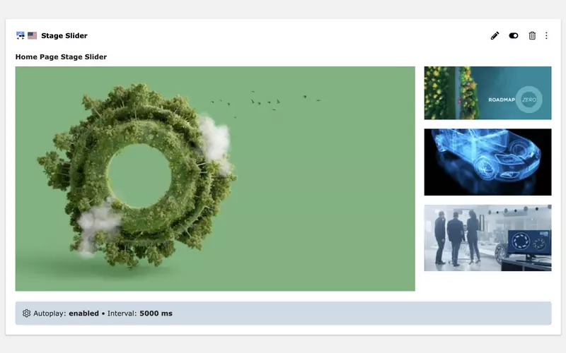
Beneath it, a blue configuration bar displays the current autoplay and interval settings. A click on the bar opens the edit screen for these two fields.
The entire accordion group can still be edited using the pencil icon on the element.
At least when using Content Blocks: Create optimized backend previews for content elements
Anyone who creates custom content elements with Content Blocks will have noticed the EditorPreview.html in the Source directory. With this Fluid template, it has never been easier to individually configure and design the backend preview of a content element.
I see two major advantages here:
1. Recognizable appearance
The backend preview of the content elements can reflect the design in the frontend. This enables editors to quickly find the section they want to revise.
The frontend styling should be slightly adapted for presentation in the backend: Font sizes can be reduced; the structure is allowed to differ.
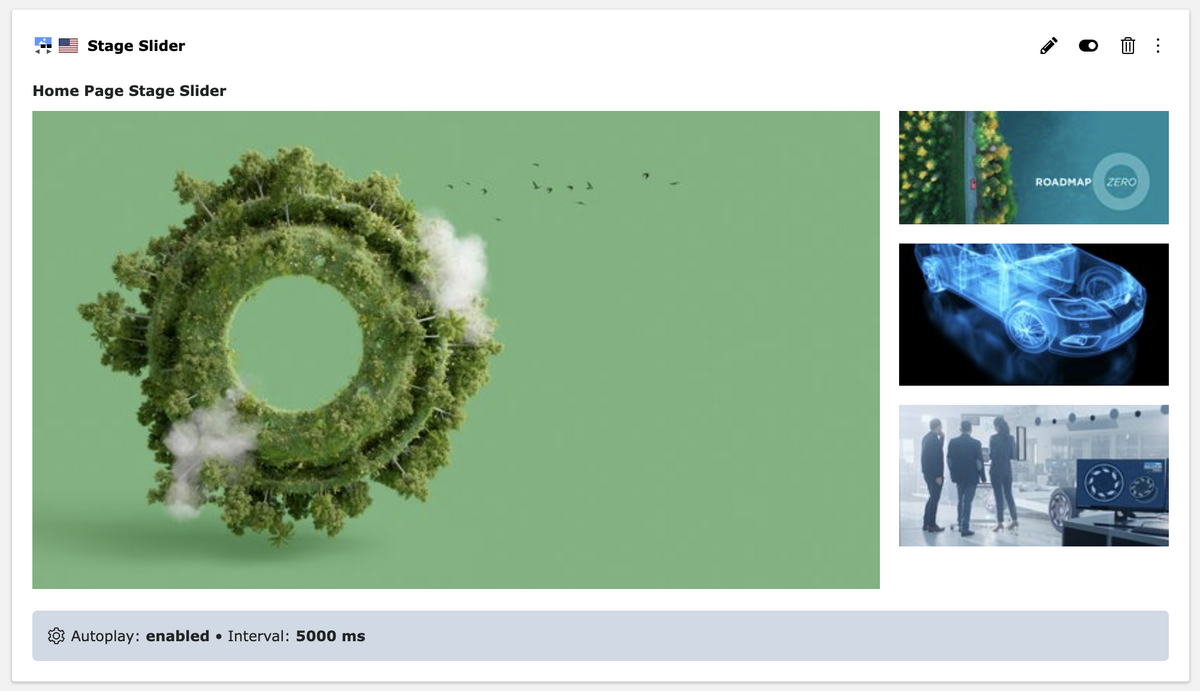
For a slider element, for example, you could arrange the individual slides in a grid and display the first, initially visible slide larger.
Who still needs frontend editing?
2. Individual editing options
By default, the preview text is linked to the entire content element. However, this can be easily adjusted using the ViewHelper.
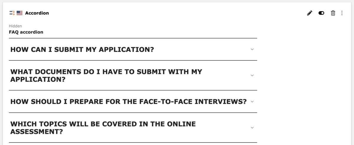
For content elements such as Accordions or Card Groups, which have inline elements (IRRE), we can link the individual child elements directly in Fluid. This allows editors to edit a single card without having to deal with the entire fields of the parent element, or the other cards. Content Blocks already provides an example of this. Especially for inline elements with a large number of fields, this makes the edit form much more manageable.
Another solution for certain content elements is the addition of a configuration bar. Here you can define the editing mode for a custom list of fields. This could be the autoplay and interval settings for a slider element, for example. For a card group, you could show the cards per row and a possible background color.

Come up with own solutions
Despite all the available configuration options, you sometimes encounter limits. Since there are enough APIs in the core, we can still support special requirements. Custom TCA field types are one possible solution (certainly more complex). However, even a pinch of CSS can be enough sometimes.
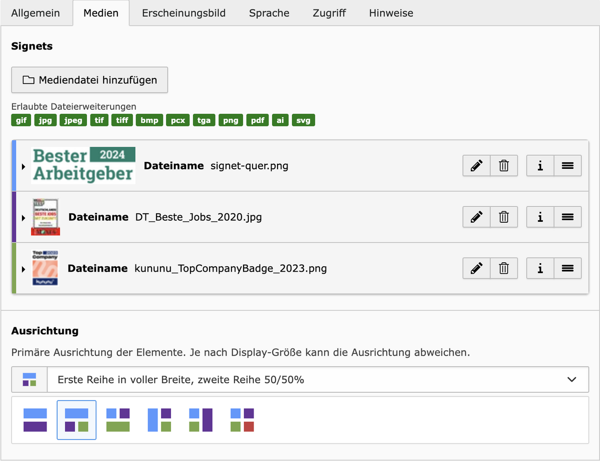
A simple example from our projects:
On one of our clients' websites, two to four signets are displayed in certain places. There are different image alignments for scenarios with strong portrait or landscape formats.
- We use a variable CSS grid for this in the front end
- In the backend, we have added an icon with colored areas for each alignment – a standard feature of the TCA as described above, technically identical to the image alignment of “Text & Media”
- The vertically listed image references are marked with these colors so that the assignment is clear – we simply added a separate stylesheet in the backend for this purpose
Closing words
The configurations presented here do not cover all the possibilities. We encourage you to explore the TSconfig documentation and install the Styleguide extension. You will find many valuable suggestions on how to make your TYPO3 project simpler, more logical and more appealing for editors. Your clients will appreciate it.
Please feel free to share this article.
Comments
No comments yet.