Hello Dark Mode, my old friend: our new frontend
Our new website has recently gone live! In the last year, our relaunch team has invested a lot of time and passion. And of course, we would like to present some of the new features and explain some decisions to you. We also overcame a few obstacles during the implementation. Today, we'll take a closer look at the frontend.
The prototype
We started with some screen design variations in Sketch. After the desired direction was decided, we were able to start developing a prototype.
This prototype is based on a Symfony application with Twig templating. This allowed us to develop the template of the new website without much overhead – no Docker and no CMS rendering process. Twig made it possible to move repeating components like the site header and navigations into partials. Thus, we got the best of both worlds: the speed of static HTML and the flexibility of a template engine.
The frontend build process with Yarn and Webpack is configured (almost) identically to the subsequent TYPO3 project. We also installed the Bootstrap Package via Composer (without any further functionality) to be able to include its SCSS partials.
We organized all stylesheet partials using the ITCSS architecture, which will keep the styles maintainable and scalable in the long term. In my point of view, we also found suitable positions for the included partials of Bootstrap (and Bootstrap Package) in the ITCSS layers.
For the approval of feature branches, a Kubernetes cluster was already available for the prototype.
When the prototype had reached a certain level, we transferred the styling to the newly created TYPO3 installation, configured the website template and content elements, and finally start with editing content.
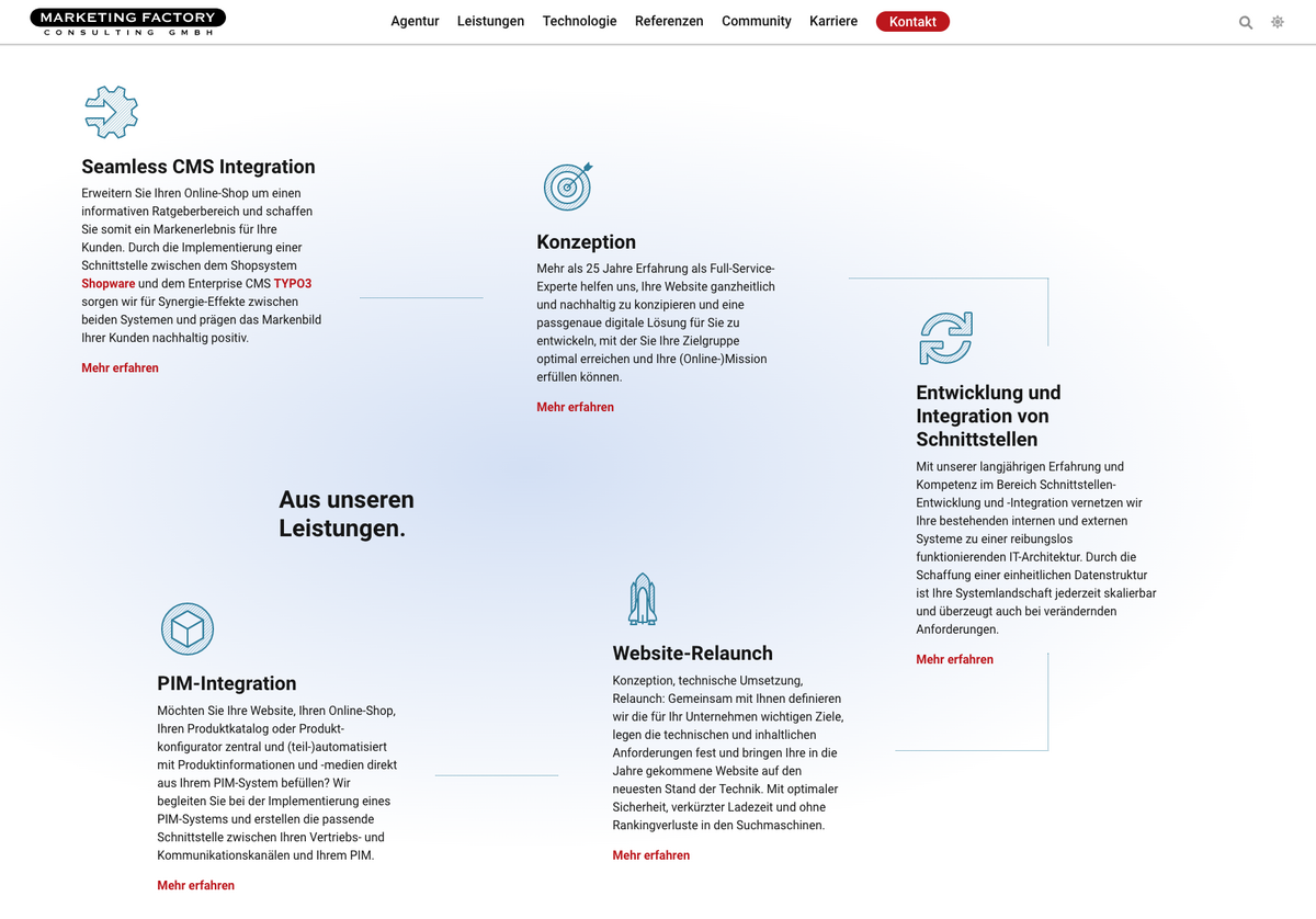
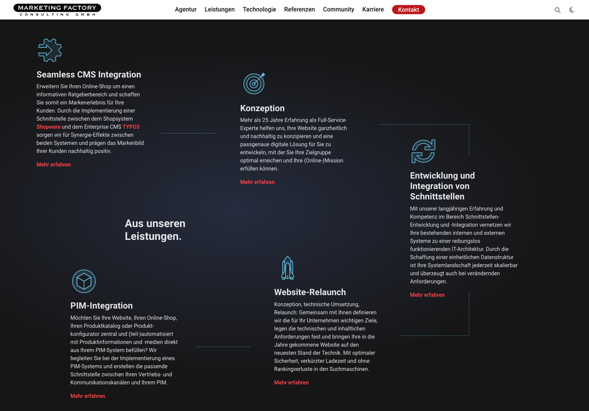
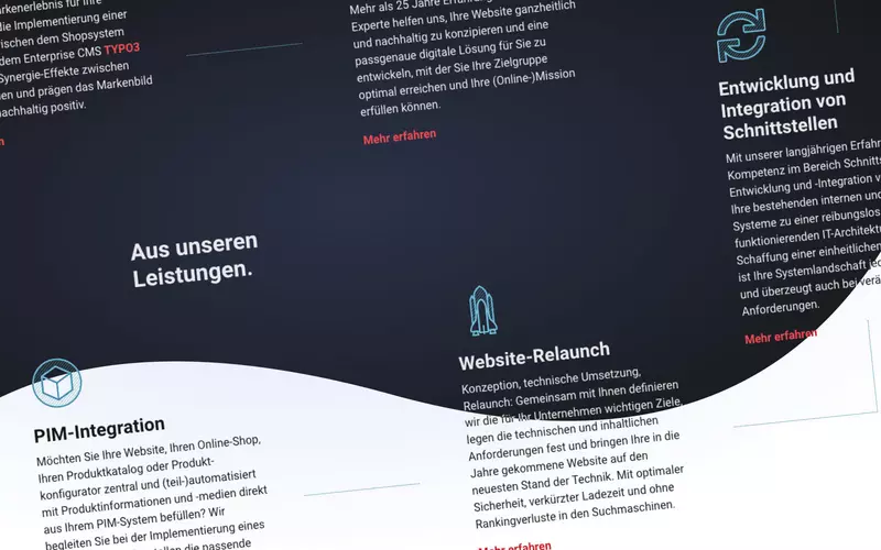
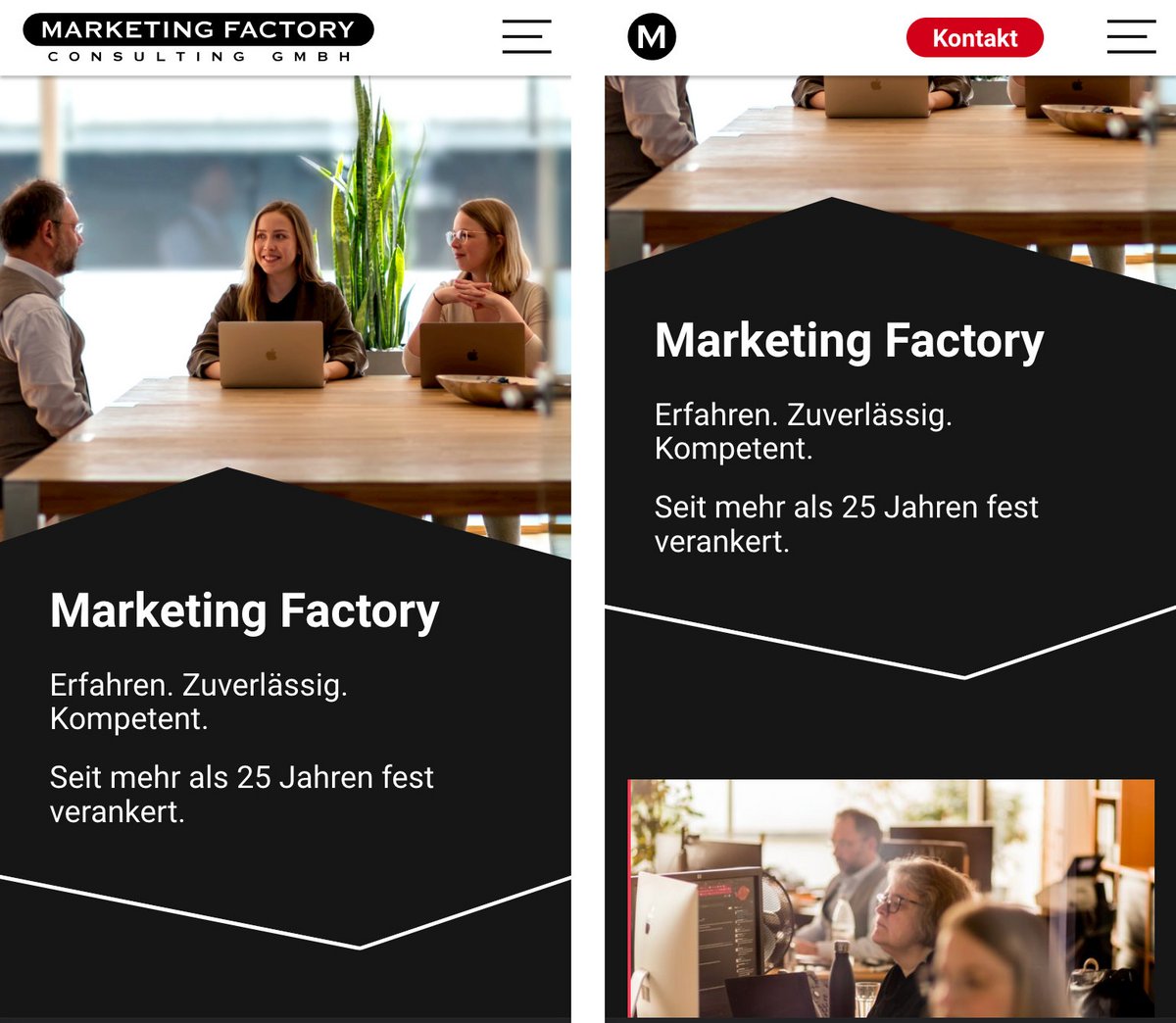
Color schemes a.k.a. light/dark mode
What do you choose when you can't make up your mind? Both! Our website can be used with a light or dark background. The content and other elements of the website adapt to the choice accordingly (except for the header, which is always light).
Initially, the selected appearance of the operating system or browser is taken into account as the color scheme. The user can make a manual selection for the page via the button in the header, which is stored in the browser's LocalStorage.
The colors are then assigned via CSS Custom Properties, colloquially called CSS variables. For each color scheme, a set of variables is assigned to the website elements. Custom properties are not required for all color values: for semi-transparent backgrounds (such as cards) the current website background simply shows through.
It has to be said, that using such color chemes means some extra work. Not only in technical implementation, but also in regards to content: logos, icons, and other images without a background must remain recognizable on both light and dark backgrounds. That's why we mostly rely on graphics in SVG format, whose source code we render directly into HTML using a Fluid ViewHelper. In the SVG code we then work with the keyword currentColor to adjust fill colors to the current color scheme. In the case of customer logos, there is a possibility to set an alternative image, which is then only shown in dark mode.
Accessibility and usability
Although this subject is only covered towards the end of this article, accessibility and usability have been taken into account from the very beginning. Among other things, all elements of our website have well-defined focus styles for keyboard control. The order of focus is kept logical; hidden elements will not be focused until they are set visible.
Starting from tablet viewport, the main navigation supports touch, mouse and keyboard control. When using the keyboard, the Enter key will open the current link while the Space bar will show the submenu (information is also communicated via screen reader). This avoids a common problem in navigations, where you need to focus every given subpage via tab key.
All the small things
Internet Explorer no longer matters to us. In June 2022, even Microsoft will finally send it into well-deserved retirement. This decision spared us some workarounds and polyfills.
For our self-written JavaScripts as well as all third-party plugins, we forgo the jQuery library and thus slim down the frontend resources.
When scrolling on mobile devices, we transform our logo to a circle to make room for the contact link. The animation initially caused some problems in Safari: after a while, the SVG transformation reset itself regardless of the scroll state. The reason was the combination of the SVG transformation and the scroll event listener. With the switch to the IntersectionObserver, the issue was solved.
That should be enough for now. In the next article, Christian will take you into our engine room.
Please feel free to share this article.
Comments
No comments yet.